Doing a Sanity Check of the Data with Pivot Tables
Go to the index page for the census-surname lessons:
Learning spreadsheets with Census Surname data
In the previous lesson, we created a compiled sheet of the top 5000 most common surnames from the 2000 and 2010 Census – i.e. a dataset of roughly 10,000 records. However, the compilation process was done by hand – clicking-dragging to select data from the sheets, manually copy-pasting datasets together. Rows/columns may have been left out, accidentally altered/erased, or accidentally included.
We could manually spot-check the compiled sheet, to verify that it contains 10,000 rows, that all of the surnames have a rank between 1 and 5000. But that’s even more error-prone hand work. We can use the Pivot Table functionality of our spreadsheet to quickly and more accurately do this kind of counting.
About the data and pivot tables
Teaching pivot tables is difficult, I imagine learning them even moreso. I first learned about pivot tables just to teach pivot tables – I had thought my programming skills covered most of pivot tables’ benefits. I now find them to be one of the best and most accessible data tools for every journalist (or analyst or researcher or investigator), but I think the learning curve can be steep if you aren’t used to thinking of how to explore data via aggregation, sorting, and filtering.
It doesn’t help that the Pivot Table interface for both Google Sheets and Microsoft Excel can be incredibly opaque and bewildering. So I’ve found that it’s easier just to experience the confusing steps with a hands-on process.
Data anticipation
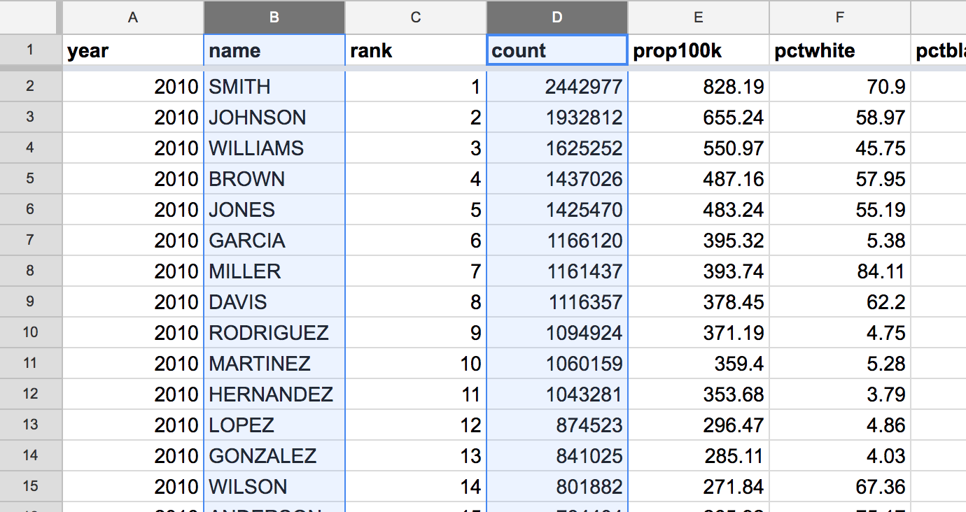
I’ve created a spreadsheet for this lesson, which includes the compiled sheet from the previous lesson:
Pivoting on the top 5000 surnames
To get the most of out trying out pivot tables, go into it already knowing the answers to find. In this situation, we expect that the compiled surnames dataset has:
- A total of 10,000 records (give or take a few, since some surnames tied for popularity)
- Exactly and only two different
yearvalues: 2000 and 2010 - The number of records per year to be split roughly 50/50
- The total
countof Americans to be significantly less than the actual number, since thecompileddataset includes only Americans with the 5,000 most common surnames - Roughly 5,000 total unique surnames, probably a few more assuming that some surnames dropped/increased in popularity between 2000 and 2010.
Pivot table lessons
Some previous (but likely out-of-context) pivot table lessons:
- Basic Aggregation with Pivot Tables
- More pivot tables and crime data
- Pivot tables and Earthquake Data
One of the most popular videos about how to successfully use Excel is Joel Spolsky’s: You Suck at Excel. Given the technically-proficient audience that Spolsky attracts, I was surprised to see him spend a good chunk of the time teaching pivot tables. Even though I was late to learn them myself, I had thought they were so fundamental to spreadsheet and data analysis as to be a “basic” skill. If you like learning via video, Spolsky’s talk is worth checking out: https://www.youtube.com/watch?v=0nbkaYsR94c
Creating a pivot table
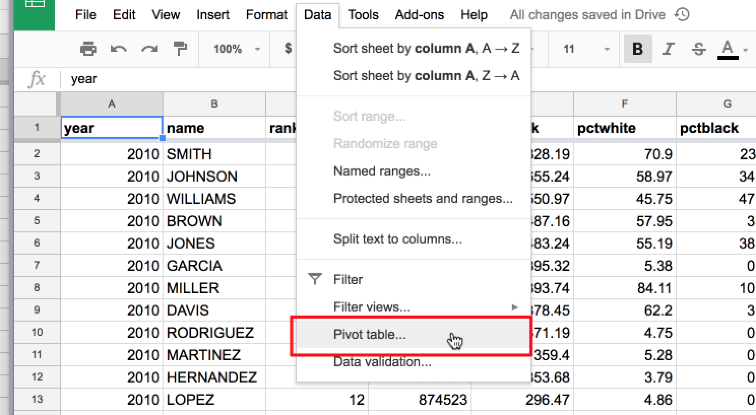
Like charts, pivot tables can be based on a selection of data. For most of our purposes, we want the pivot table to consider the entire sheet. The easiest way to ensure this is to click into any single cell. But not multiple cells, as the Pivot Table tool will interpret that as a range of data to pivot upon.
To create a pivot table, click the Data menu, then the Pivot table… action:
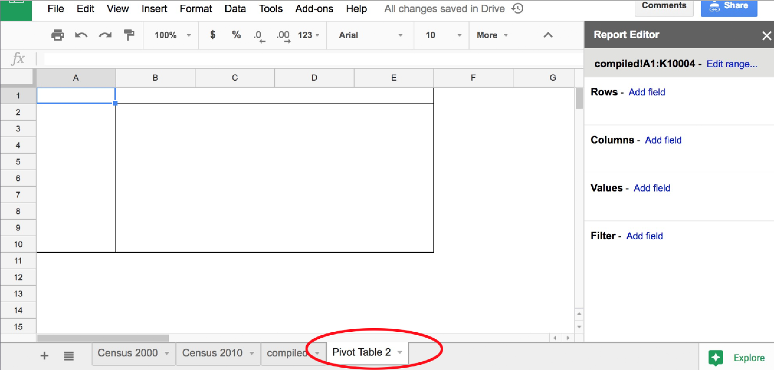
This will create a new, seemingly-empty sheet, which will be named something like Pivot Table 1:
What to pivot on
In our current situation, we just want to confirm that there are about 10,000 rows in the combined sheet. And roughly equal number of rows (i.e. 5,000) for each of the two possible year values: 2000 and 2010.
The Report Editor
Turn your attention to the Report Editor on the right side. Sometimes clicking on a random spot in the Pivot Table sheet will cause the Report Editor to hide. To bring it back into view, click the A1 cell:
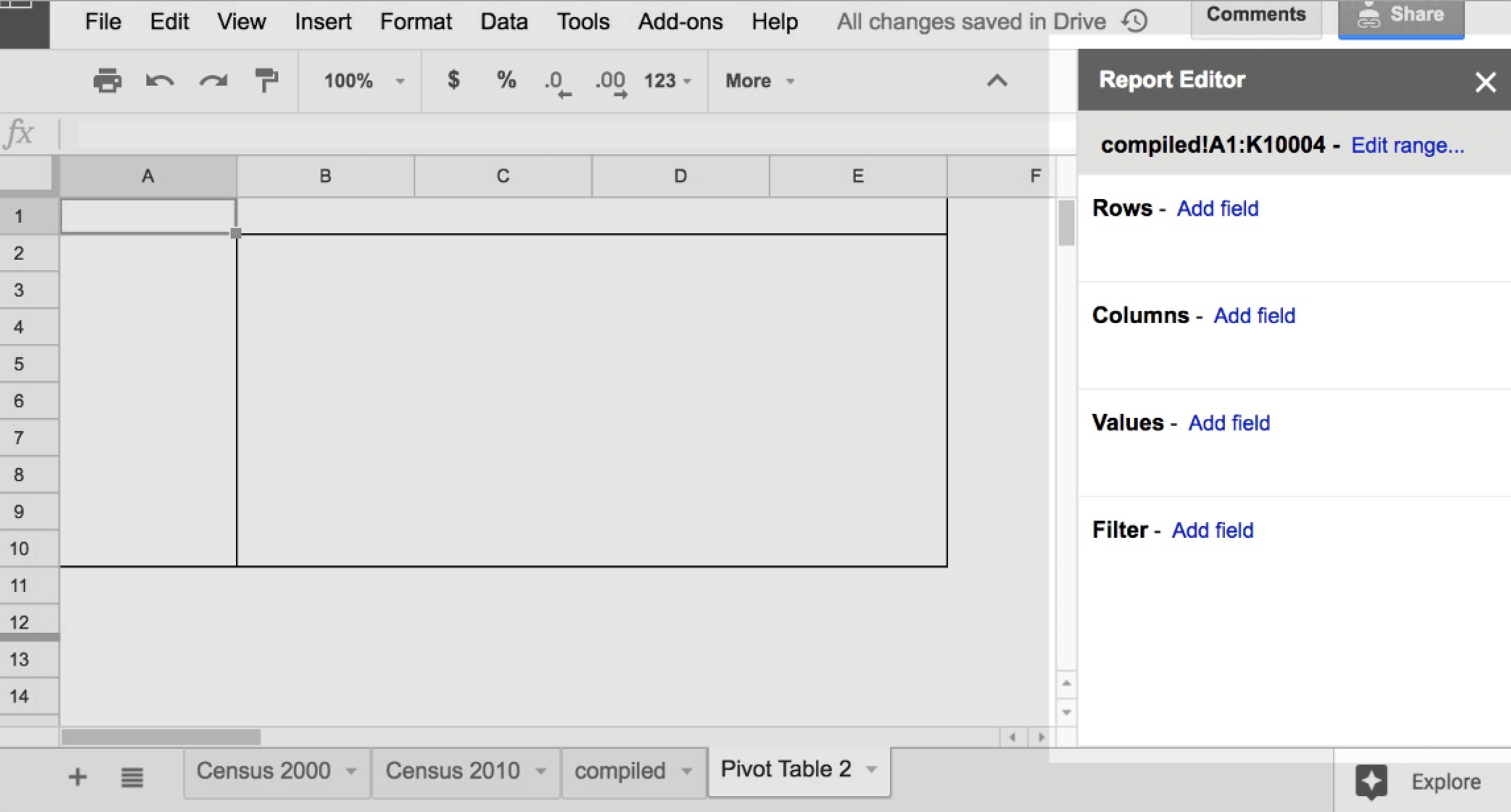
Under the Report Editor menubar, you can see something that seems to vaguely describe the data that the pivot table is ostensibly “pivoting on”:
compiled!A1:K10004
The compiled sheet, cells A1 through K10004 (I think)
Adding rows to the Report Editor
Usually, the first step in creating a Pivot Table is to add a field to the pivot table’s rows:
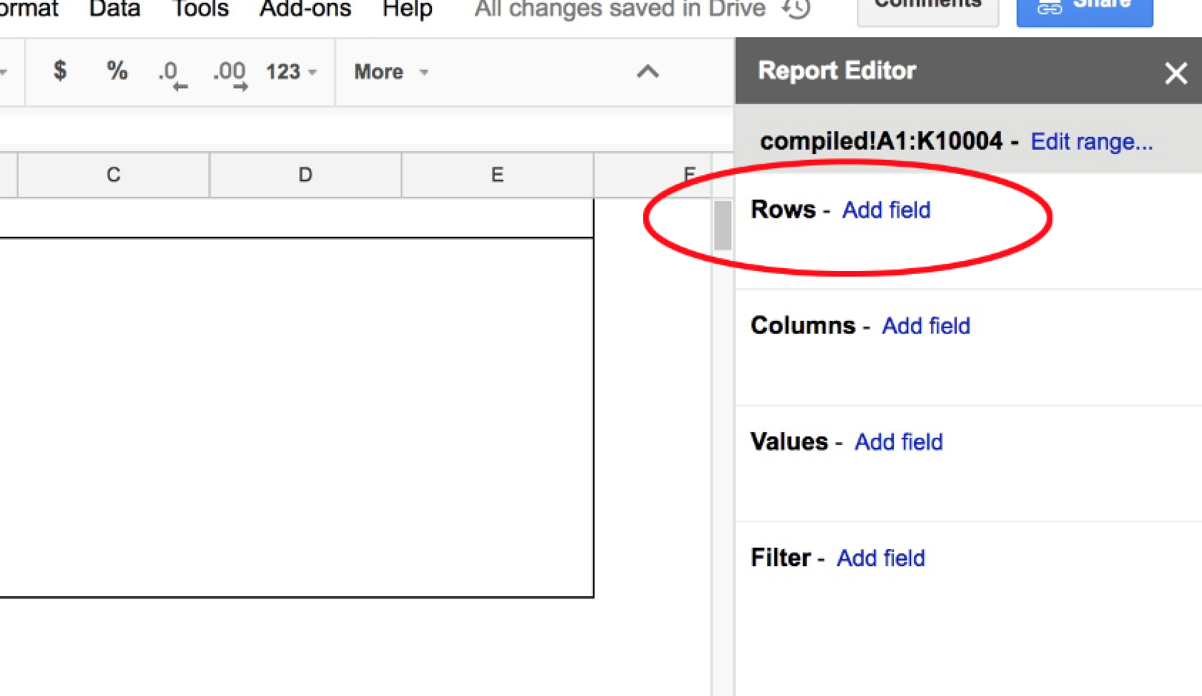
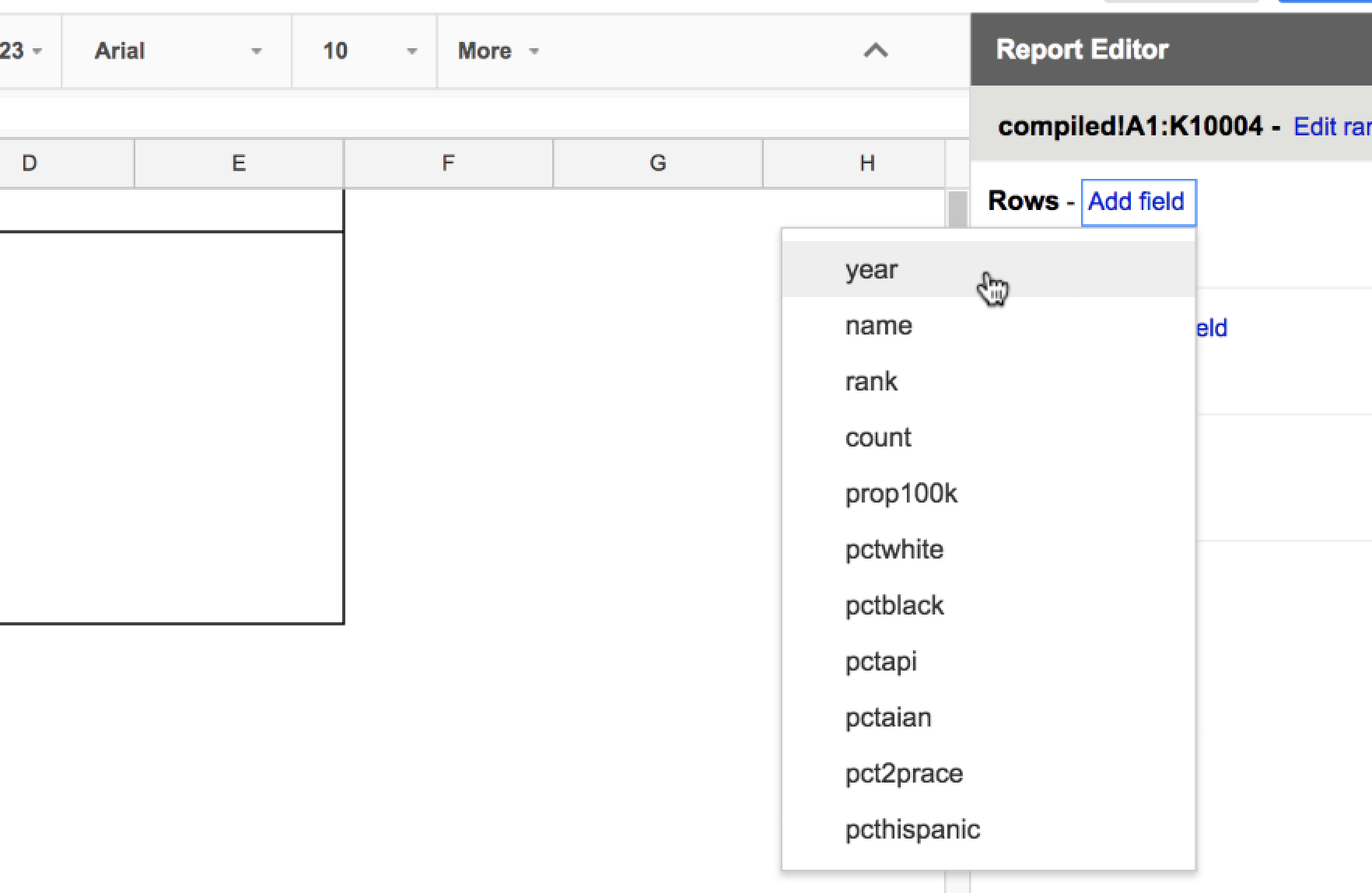
Click the Add field link that’s next to the Rows subhead. You should see dropdown list of familiar terms – all the column headers of the Census surname data. Since we wanted to get a count of records by year, select the year option:
The pivot report, previously empty, should now have 2 new rows – one for each year value, and an additional Grand Total row:
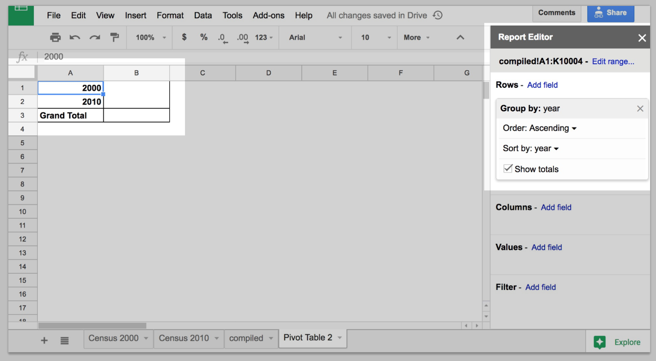
If there were any other year values besides 2010 and 2000 – including blank values – we would see them as extra rows in the pivot table. That we only have 2 rows is nice assurance.
Adding values to the Report Editor
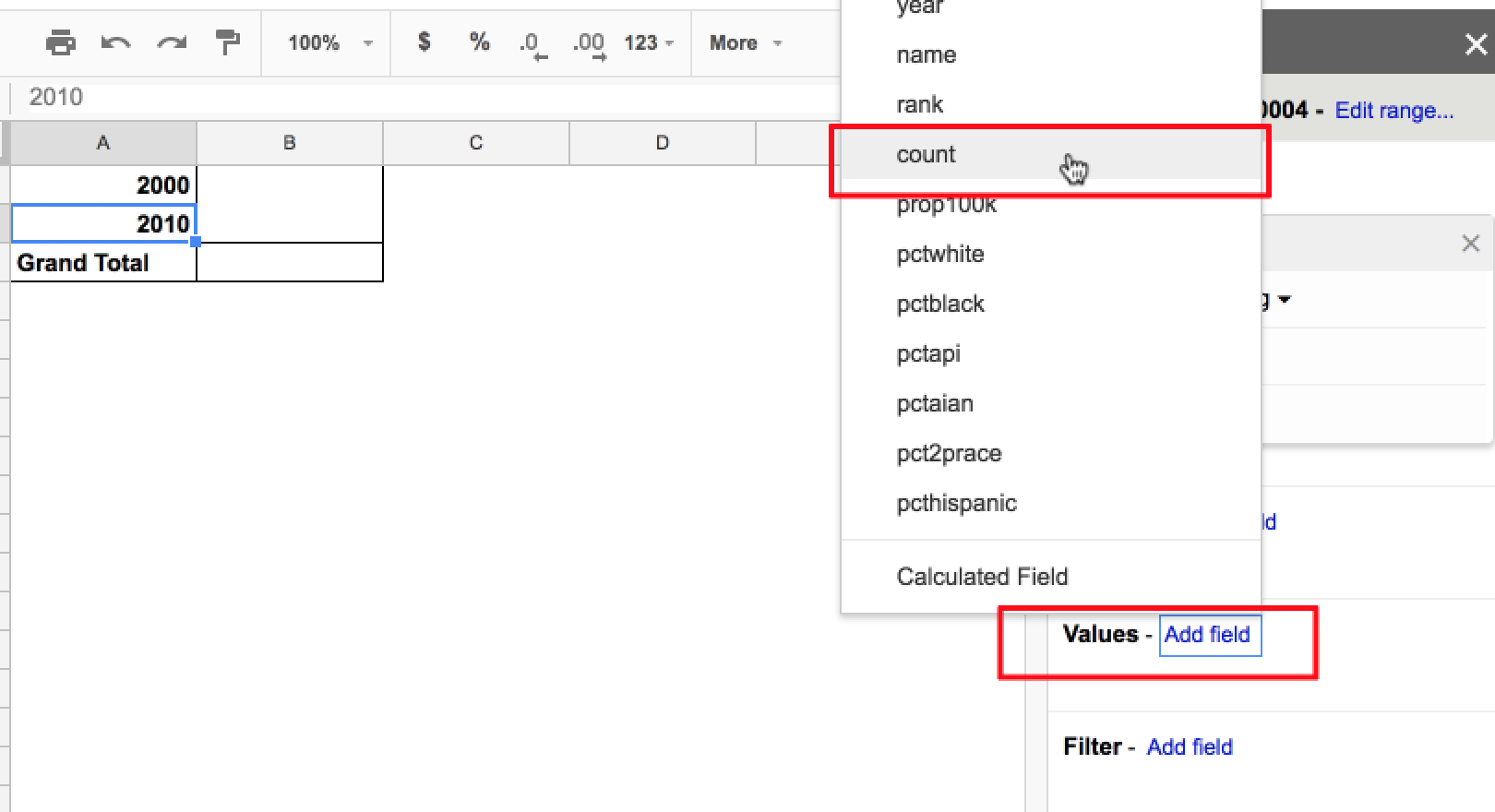
The next Report Editor function-to-try may appear to be Columns, but we’re skipping that for now. Instead, go to the Values section and click Add field
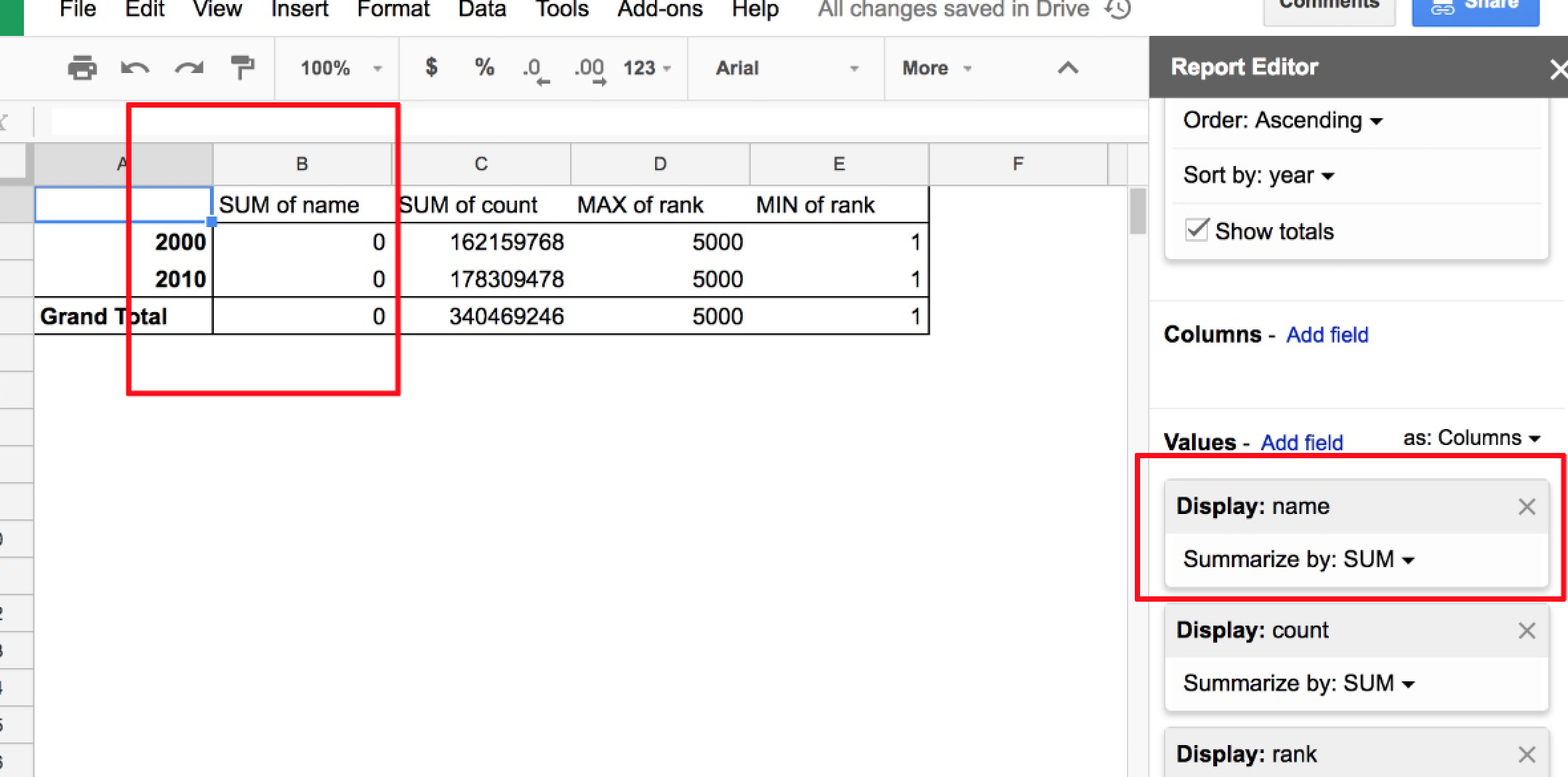
Again, you’ll be presented with a pop-up menu of column headers for surname data. Choose the count field, which, to refresh your memory, is the number of Americans estimated to have a given surname:
No new cells will be added to the pivot table, but the existing empty cells will be filled. Note the display item that popped up in the Values menu. By selecting the count column, you seem to have created an aggregation of the count values – a SUM of them:
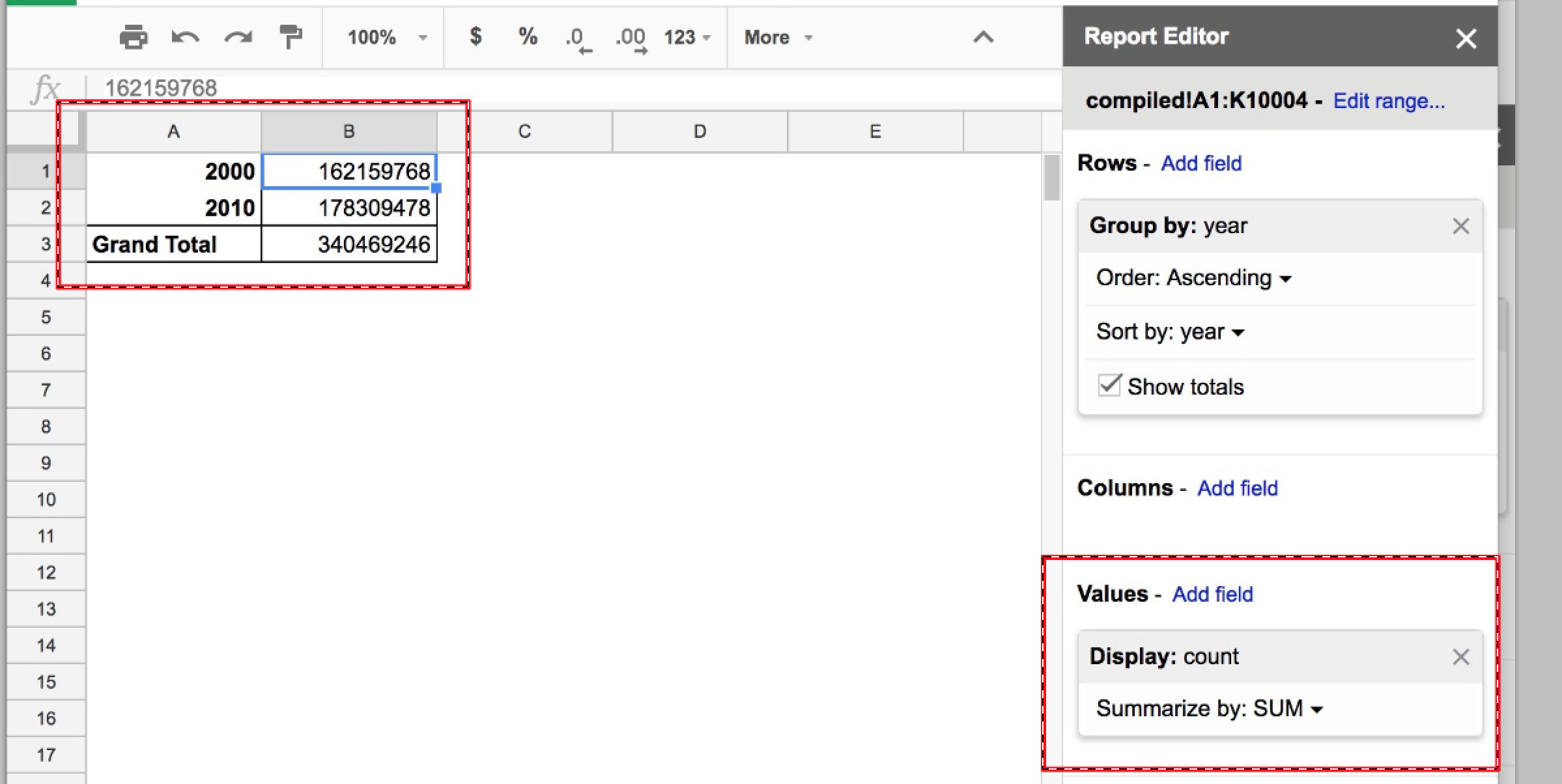
Look at the summed values for 2000 and 2010: 162,168,768 and 178,309,478, respectively. That seems very low for the count of Americans with surnames, untl you remember that our dataset doesn’t include all of the Census data, just the top 5000 common surnames for each year.
Aggregations besides SUM
Let’s add another value field: rank. By default, the aggregation performed on value fields is SUM, which doesn’t make much sense:
Go back to the Report Editor’s Values section. Click the dropdown icon next to SUM label for rank to see a menu of all the possible aggregation operations. For rank, let’s pick one that we can predict the answer to: MAX:
While we’re here, add a new Value field for rank, and aggregate by MIN. Each new Value field adds a new column to the Pivot Table. The results for rank should feel boring – we would expect that the smallest value in rank would be 1, and the biggest 5000:
Counting names per year
Originally we wanted to check and see if there were roughly 5,000 rows/surnames per year. Let’s do that now by going to the Report Editor’s Values section and add another field: name. Note that it’s possible to click-and-drag to rearrange the order of the Values columns. I’ve put the name field up top, and you can see it reflected in the pivot table:
As previously mentioned, the default aggregation on a Values field is to SUM all the values. But the values of the name field aren’t numbers, they are text strings, like LEE and JOHNSON. Adding them up as numbers is nonsensical; I’m not even sure why the pivot table shows a result of 0.
In any case, we want to use a different aggregation, one that counts the different name values.
COUNT, COUNTA, COUNTUNIQUE
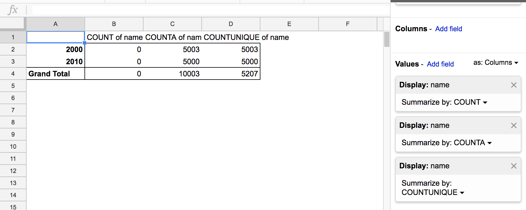
I’ve reworked my pivot table to have only Values fields for COUNT, COUNTA, and COUNTUNIQUE aggregations of the name field. Check out the results:
Here is the Google documentation for the 3 functions:
Apparently, the COUNT function only counts the number of numeric values. That the COUNT value column is just 0 makes sense, then. As to why COUNTA and COUNTUNIQUE are both equal – this means that in no given year did any of the top 5000 names repeat themselves, e.g. there weren’t two separate listings for NGUYEN.
Which is a good thing!
Why pivot. Why aggregate
There’s more to pivot tables than using them to check the meta-stats of your data, e.g. does my dataset contain all the expected values?. But the core power of the pivot table is how quickly it allows us to explore data through summarization and aggregation.
Getting a dataset with just a dozen rows is practically worthless – what interesting insight could an analysis of 12 data points possibly discover that couldn’t already be contained and explored in the average person’s brain? But getting a dataset with thousands/millions of data points can be just as useless if you don’t know what the big picture is.
Usually, you’ll know what the big picture is. It’ll be something like: for each city/agency/school, I want to find the city/agency/school with the most/worst/oldest/newest [whatever]. Because if a certain group is an outlier, there’s a story for why they’re different than everyone else.
The problem is whether you can make those comparisons and calculations when given a bunch of raw data. Being able to group data by categories and to view it at different summarization levels can greatly help in finding stories and meaning in the data.
Aggregation/visualization as simplification
I don’t think it’s an insult to say that data visualization represents a simplification of the raw source data. But raw data can’t often just be plugged into a visualization tool. It takes your personal effort and insight to know how the data can and should be simplified before trying to visualize it.
Going back to the compiled sheet of Census surname data with 10,000 rows, what happens if you try to visualize it? I wouldn’t even know where to start – what is the visualization program supposed to do with 10,000 rows of names and demographic data? What is anybody supposed to do with it?
If you can’t figure out your mess, neither can the computer
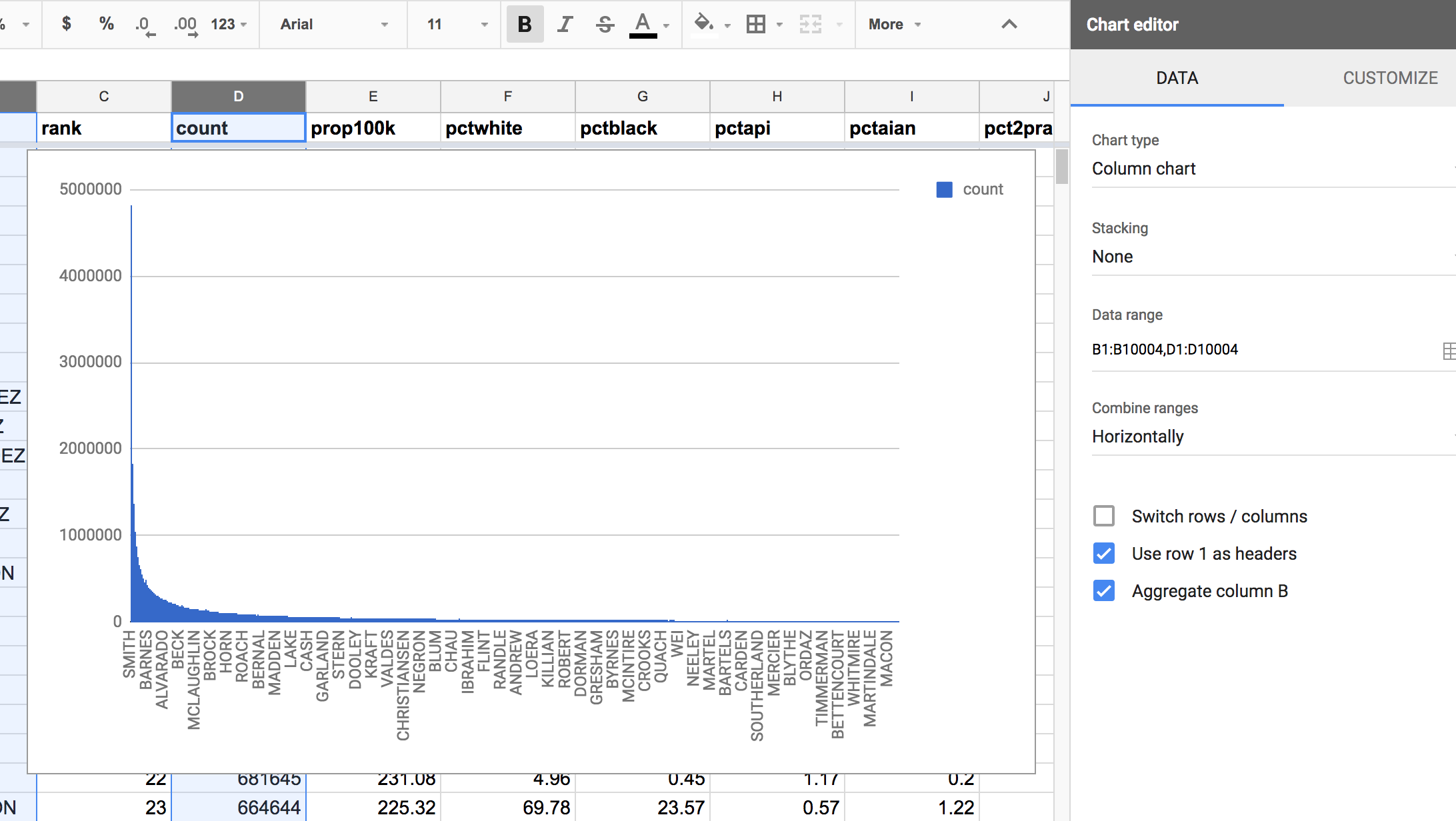
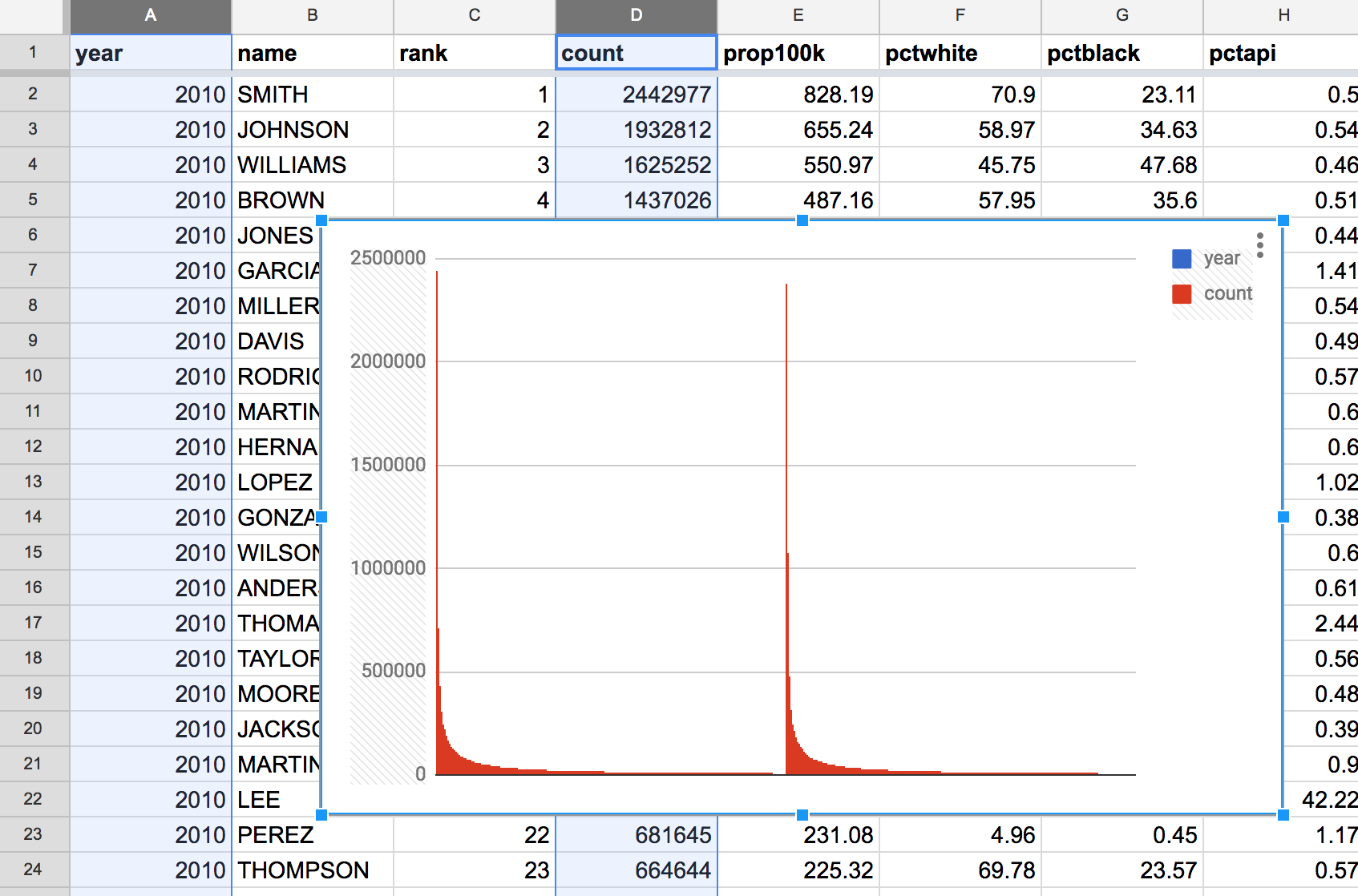
Let’s try feeding Google Sheet’s visualization wizard with all 10,000 rows of the name and count column:
Passing these 2 columns to the Insert chart action, Google’s default is to create a column chart (5000 columns!). It’s not nothing, but it’s not really anything either:
Telling the computer what to group by
Here’s another attempt: passing in the year and count column. Google’s default response is not good:
It’s worth taking a look at the Chart Editor options. The “Column chart” type seems fine. But look at the other options:
- Switch rows / columns
- Use row 1 as headers
- Use column A as labels
- Aggregate column A
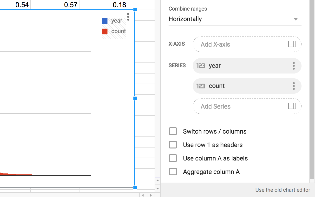
Let’s try these options one-by-one. Except for “Switch rows/columns”, as that doesn’t make any sense.
Use row 1 as headers
Apparently, the way I selected data doesn’t automatically imply that row 1 is meant to be used as the headers row. Selecting that option doesn’t seem to change anything, other than to add labels to the legend (which itself doesn’t make any sense):
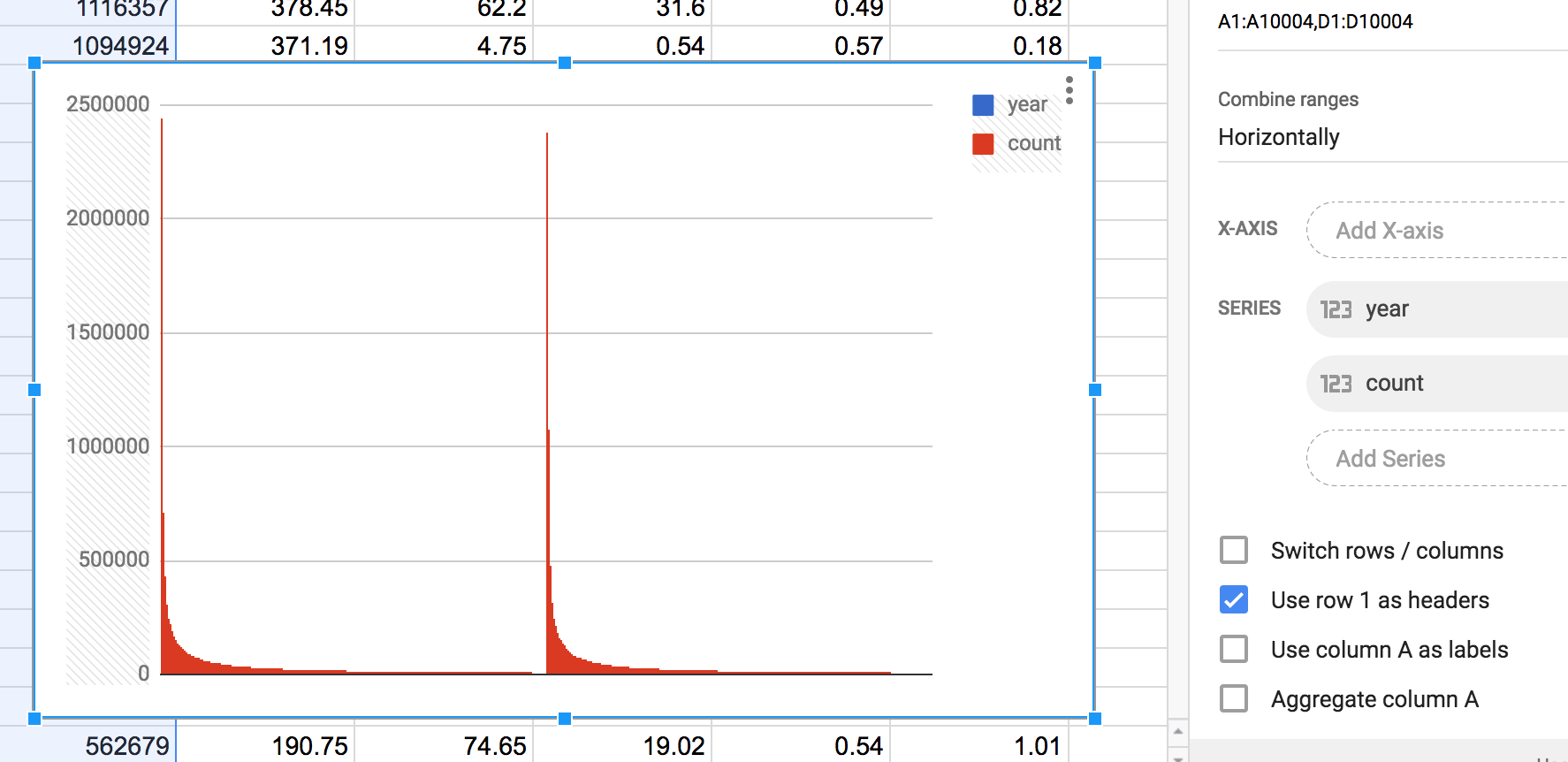
Use column A as labels
Column A of the surname data is the year column. In my mind, this chart would at the very least show the count of names by year. Which means that the year values of 2010 and 2000 would show up somewhere on the chart, such as the x-axis:
Now that looks like an actual chart. There are two columns that appear to correspond to the values of 2000 and 2010. However, looking at the actual values for count, it appears that the two y-values correspond to the most common surname of each year. I guess it’s not nothing. But it seems strange for the chart to show only 2 data points out of the 10,000 given to it.
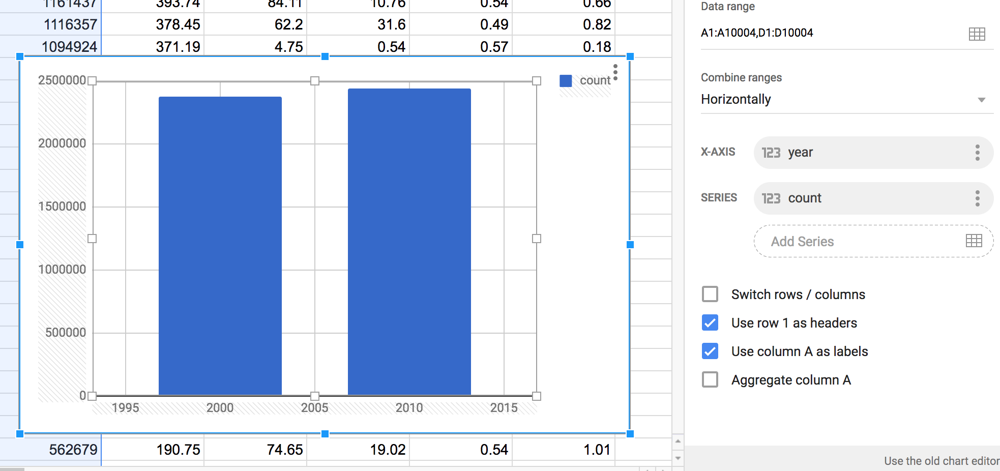
Aggregate column A
This is the option that turns our sloppy chart attempt into an actual chart that uses the data.
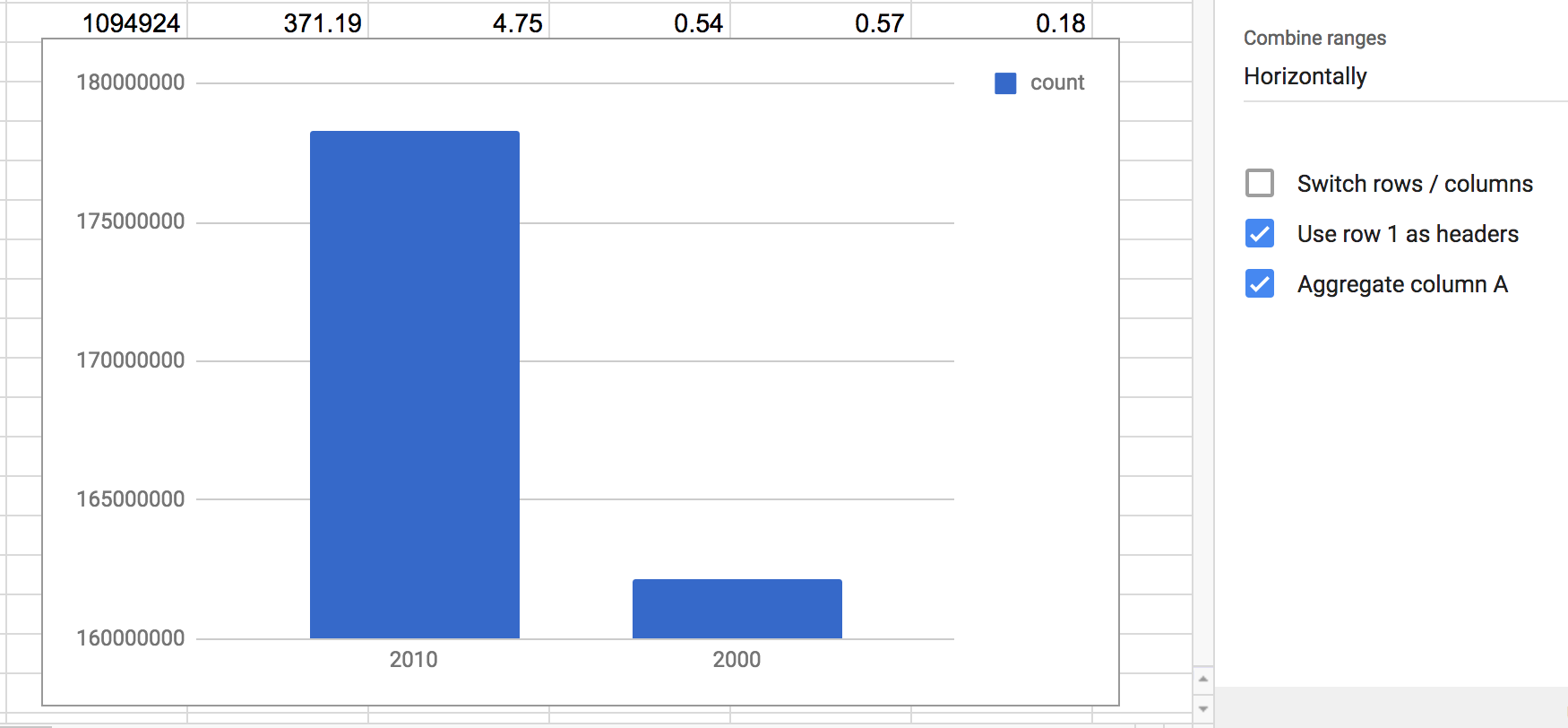
First, the aggregation option appears to supersede the “Use column A as labels” option. By aggregating column A, i.e. the year column, we get two labels on the x-axis, 2000 and 2010.
The y-values appear to be the sum of the count values for each years. This makes sense as we know that in 2010, more people were among the top 5000 surnames than compared to 2000. Which is to say, we don’t know much at all. It could be that there are just correspondingly more people in America in 2010, while the common last name distribution remains the same.
In any case, this chart shows something that we can at least explain, even if it’s not much of a story. Note how the Google Wizard has no qualms about setting the y-axis to something non-zero, making it appear that 2010 had 10 times the aggregate count compared to 2000.
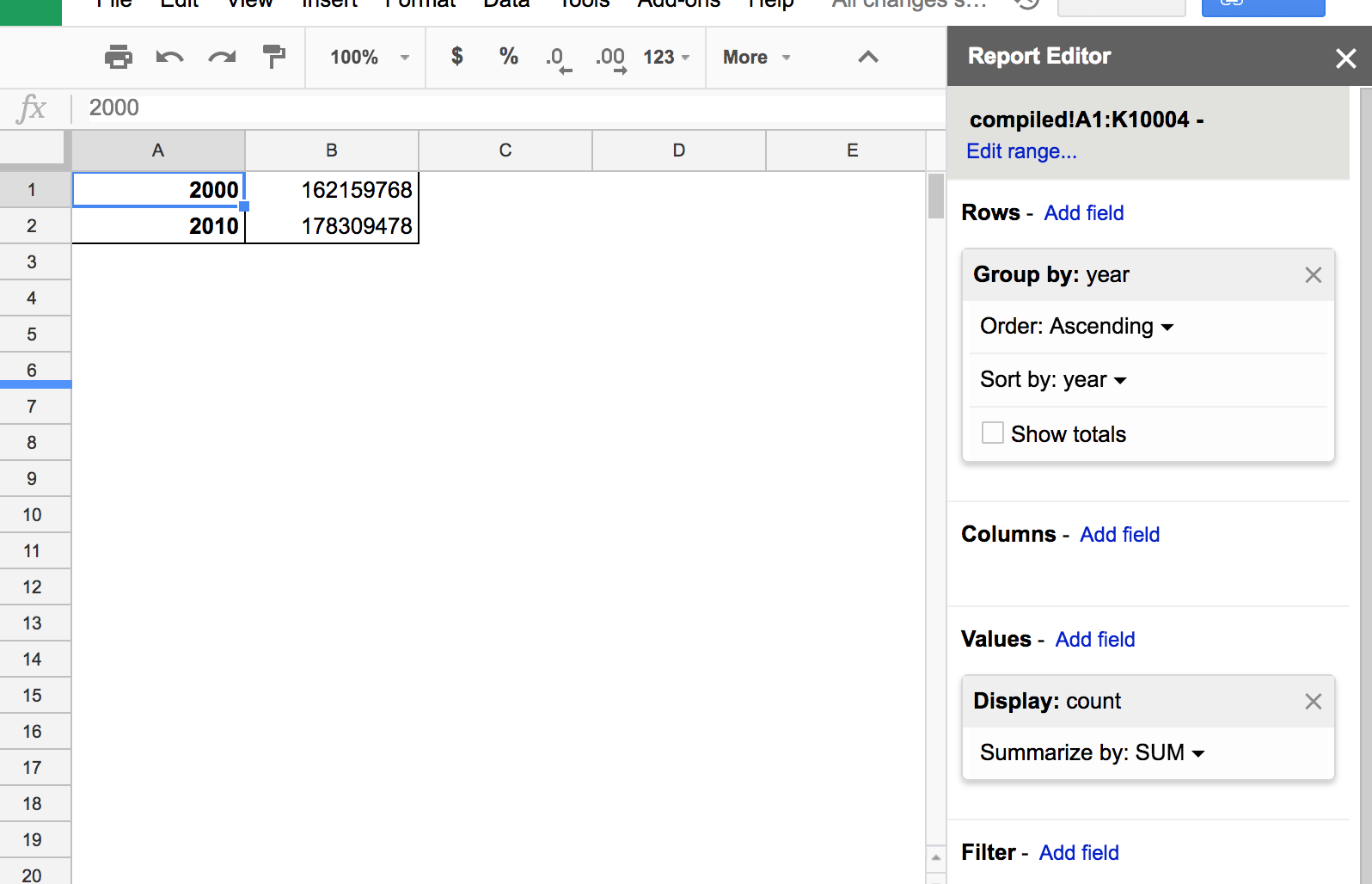
Using a pivot table to sum count by year
Before we end this lesson, let’s replicate the data table ostensibly behind the chart showing aggregate count of surnames by year.
From the compiled table, create a new Pivot Table (the previous one will remain as is).
In the Report Editor:
- Add the
yearfield to the Rows section - Add the SUM of the
countfield to the Values section - Remove the Grand Total row by unchecking the Show totals option.
The results and process should feel similar to our first pivot table, as the steps are pretty much the same:
Now to create a chart from the pivot table. For many intents and purposes, a pivot table is like any other data table, with the main exception that you aren’t supposed to manually alter the table’s structures and values beyond using the Report Editor. But we can pass it directly to the Chart Wizard by highlighting the table and using the Insert chart… action:
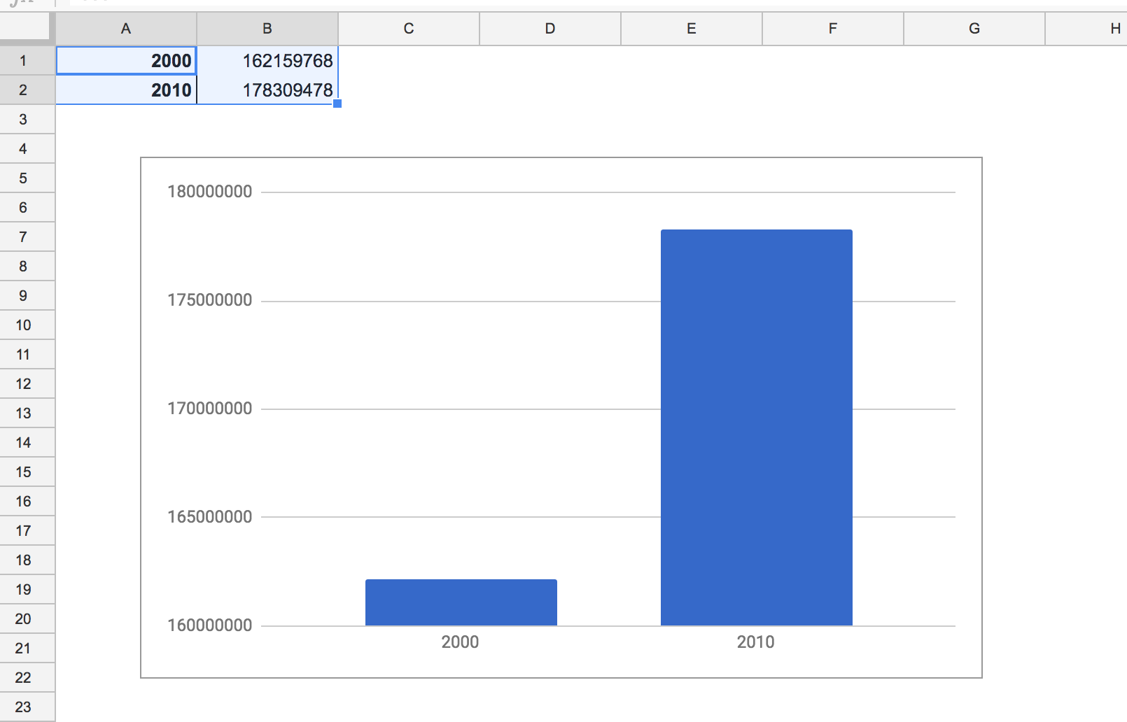
Randomness is suffering
OK, using a pivot table to create a basic column chart may not feel like much of a victory. Because it literally is the same chart as the one created in the previous section.
However, the important difference, one that is admittedly hard to appreciate right away, is that the previous attempt at charting the raw compiled data involved a desperate, confused process of trial-and-error. Only by tinkering with the Chart editor options – and already spending a lot of time thinking about what our data contains – were we able to come up with something remotely usable. And that was after the Google visualization app burned a few extra of our laptops’ lifecycles just to process the data dump we gave it.
In contrast, using the pivot table to aggregate the compiled data should have felt more rational and purposeful. Yes, the Pivot Table interface is a bit strange and wonky. But once you get used to how it can be used to aggregate and explore raw data, it’s a matter of memorizing the conventions to get to those insights.
The visualization at the end of this lesson was unsatisfactory because we didn’t have any ideas of what insights are in the Census data. In subsequent lessons, we’ll be less preoccupied with the tedious work of data wrangling and learning pivot tables.