Gentle data cleaning with the Census surnames data
If a dataset comes from someone else, they didn’t collect it for you. They didn’t design it for you. So they probably didn’t make it as convenient or accessible to you as it could be. This lesson contains some examples of how data can be rearranged and reorganized to your personal preference. It’s not meant to be an advanced data wrangling lesson, but the techniques and motivations to make these quality-of-life changes aren’t much different than the opinionated decisions you’ll need to make when wrangling a dataset for “real”.
Go to the index page for the census-surname lessons:
Learning spreadsheets with Census Surname data
Cosmetic changes
First, let’s start with small cosmetic changes that don’t affect the underlying data values or structure. These small quality of life changes can make data work at least slightly less annoying. More importantly, all of these steps (I think) are reversible.
Change the font
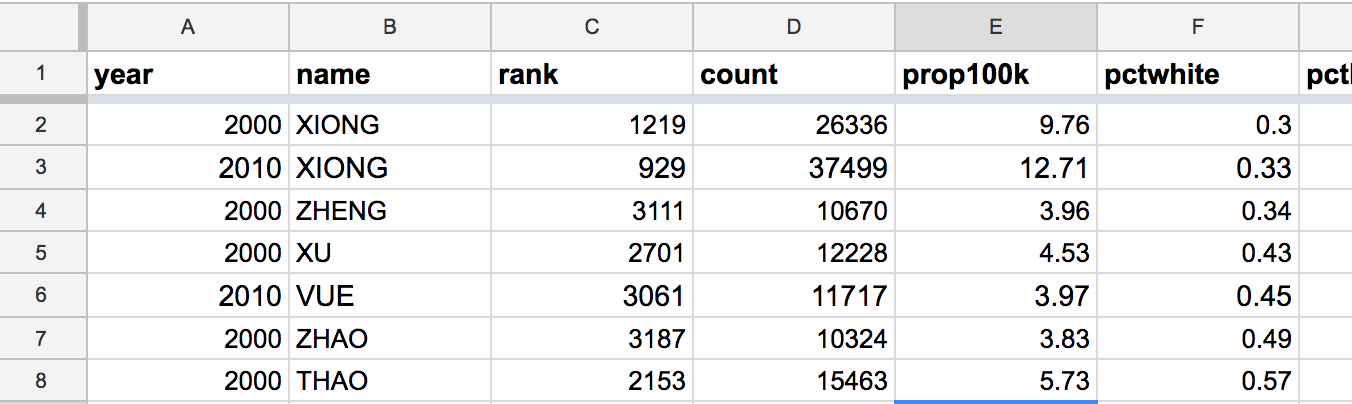
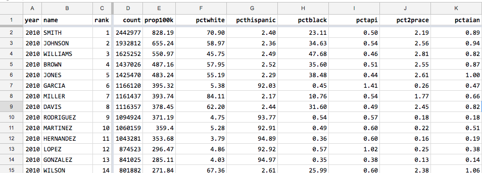
Apparently, I published the 2000 and the 2010 Census data using different fonts: 10-point Arial for the former, 11-pt for the latter. No idea how it happened but it’s definitely annoying:
Easiest way to change the font for the entire dataset:
First, hit Command (or Ctrl) + A to select and highlight the entire sheet.
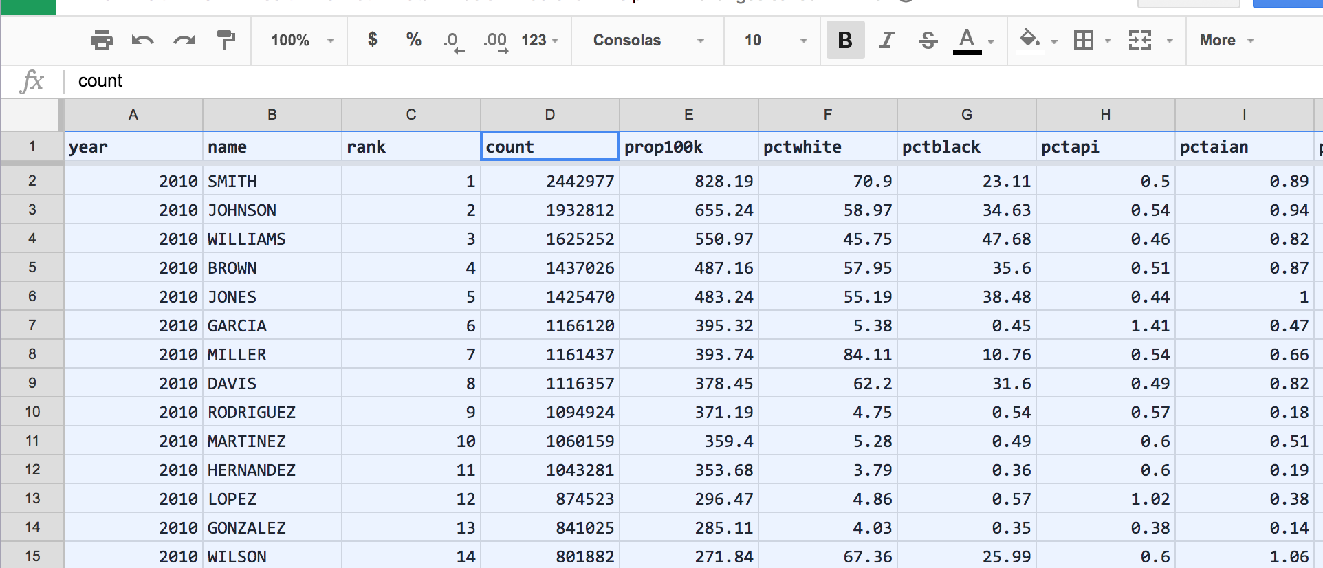
Then, in the formatting toolbar, choose a different font-size and font-family. I’m going with the Consolas monospace font at a 10-point size:
Slim down the columns
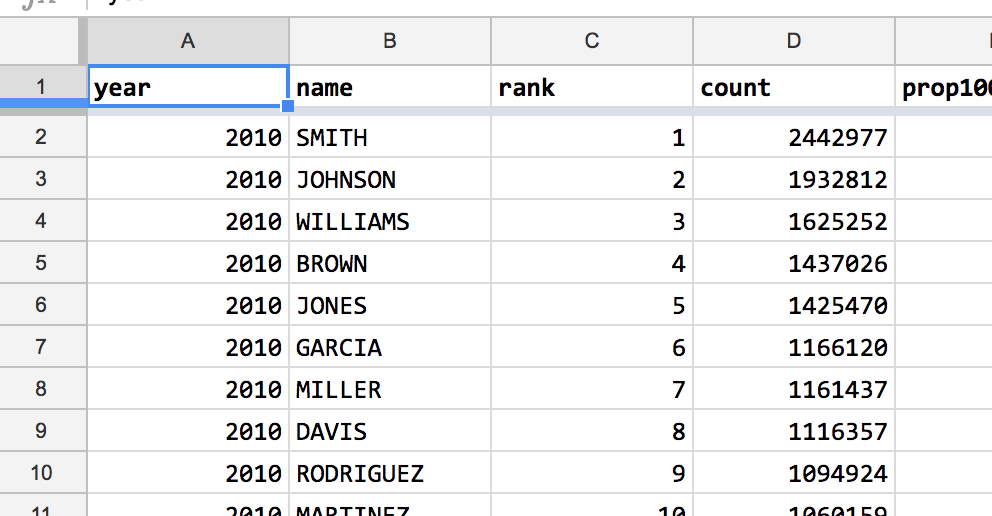
The year column is twice the size it needs to be to handle 4-digit numbers:
The rank column also only has to hold 4-digit wide numbers at most. Maybe count and prop100k are too spacious too. It’s easy enough to resize multiple columns in one step.
To select a column, click on the column label, i.e. A for the year column. Hold down the Command key (Ctrl for Windows) to add individual columns:
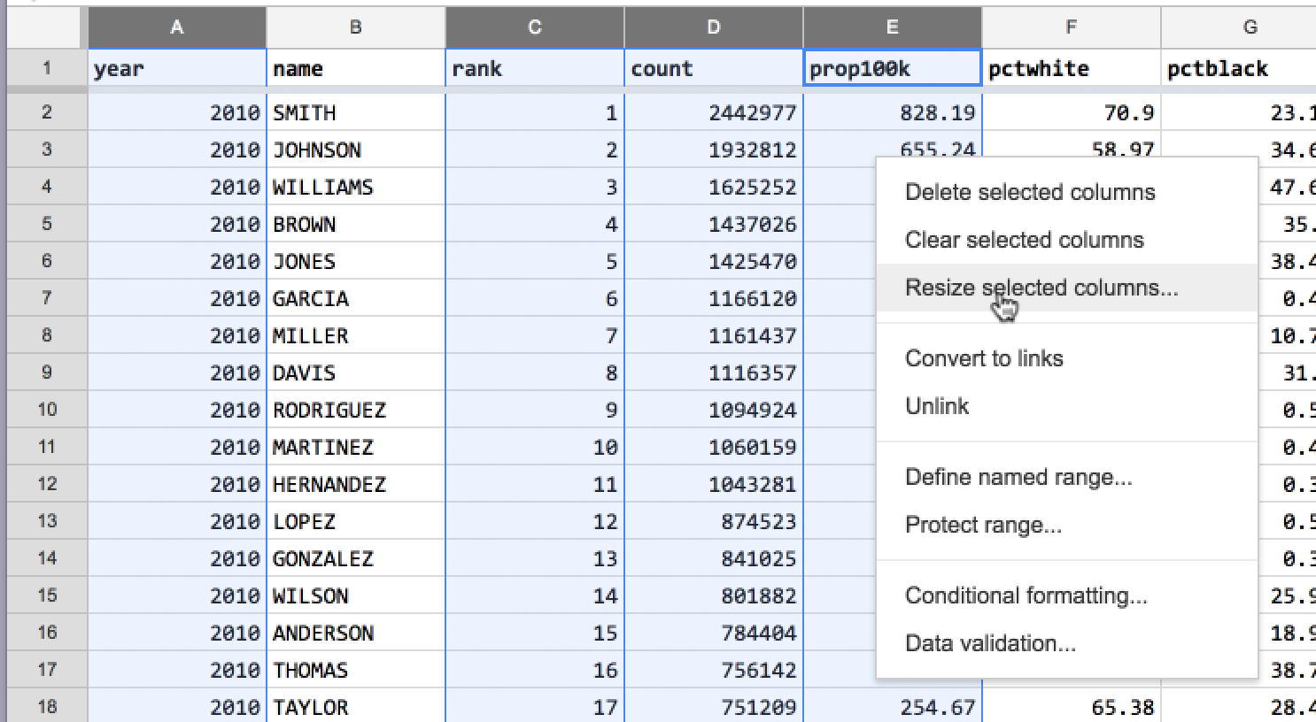
After selecting the columns, right-click on any part of the selection to bring up a pop-up menu.
Select the menu action, Resize selected columns:
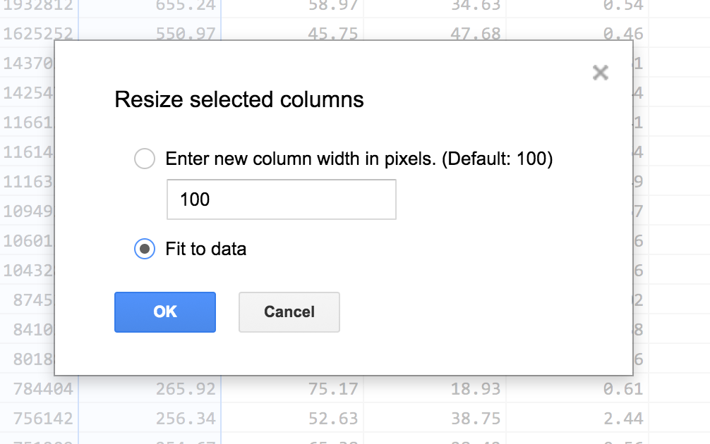
In the “Resize selected columns” dialog, select the Fit to data:
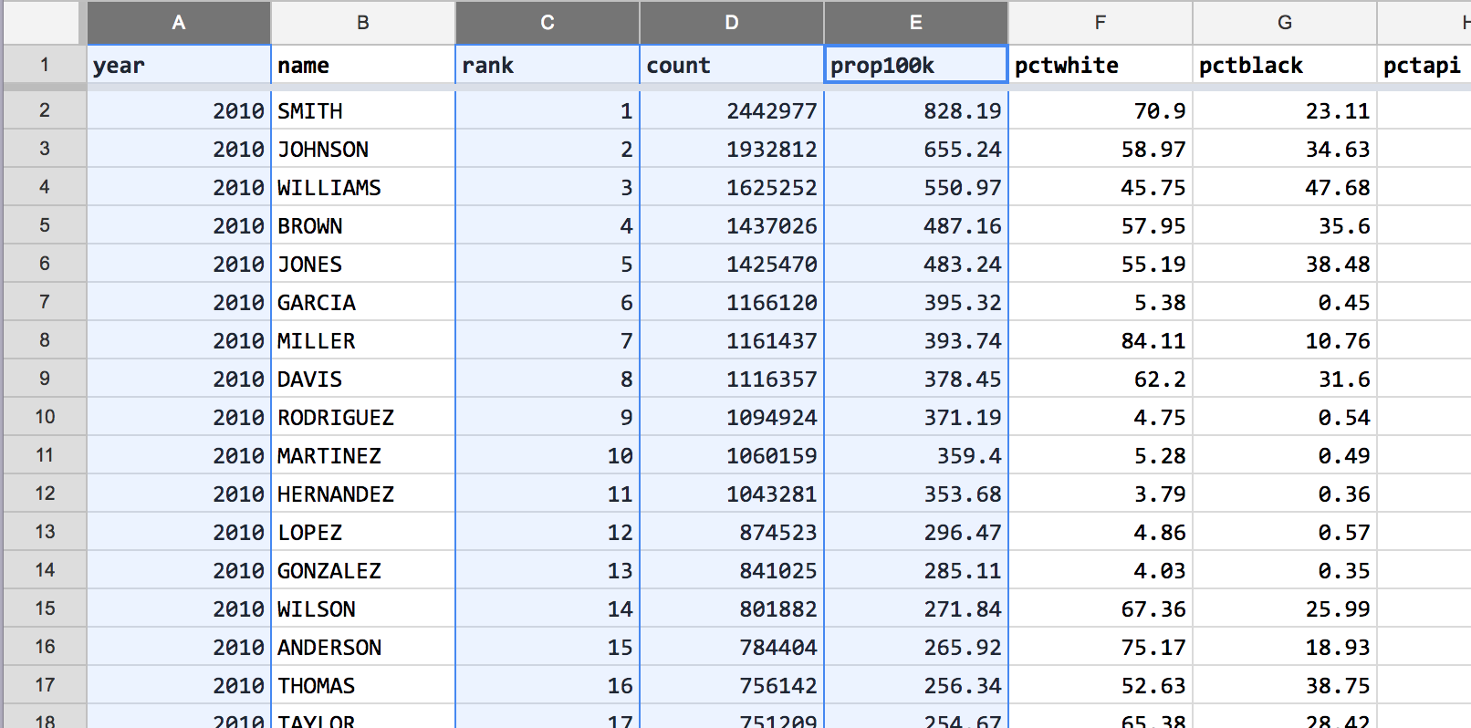
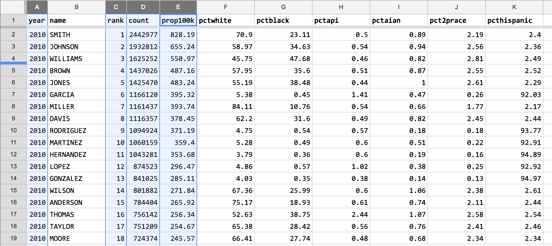
The result – more space for cram additional columns onto the screen:
Realign the column header text for the numerical columns
It’s best practice to have columns of numbers be right-aligned for easier comparison. It looks awkward when the column headers are left-aligned:
Individual cells can be added to a selection by holding down Command/Ctrl. Text alignment can be changed by going to the menu item, Format > Align.
The result:
Displaying percentages with 2 decimal places
In the various pct columns, some values have 2 decimal places while others have 1. The resulting misalignment makes it hard to compare numbers by eyeball – look at the first 2 rows of Column F, in which 70.9 looks smaller than 58.97:
Rounding the two-decimal-place values – e.g. 58.97 to 59.0 – would destroy information. The better solution is to use the number formatting options to specify exactly two decimal places for every number. 70.9 would turn into 70.90, which is numerically equivalent.
To change the visual format of a column’s numbers, first select the entirety of the columns to re-format.
Then go to the Format > Number menu. One of the standard options – 0.00 – will work fine for my case.
Much better:
Freeze the year and name columns
I anticipate that this spreadsheet will get more columns. When the columns can’t fit the spreadsheet viewing area, it’s hard to line up the values on the far-right columns with the left-most columns, e.g. year,“name“, and rank. I’m pretty sure year and name are the two of the most important things to know about any given row. The rank column might be superfluous, but it does provide some context about how popular a name in a given year was. Plus, it’s a fairly narrow column.
(If you freeze too many columns, then you vastly limit the scrollable space on the right)
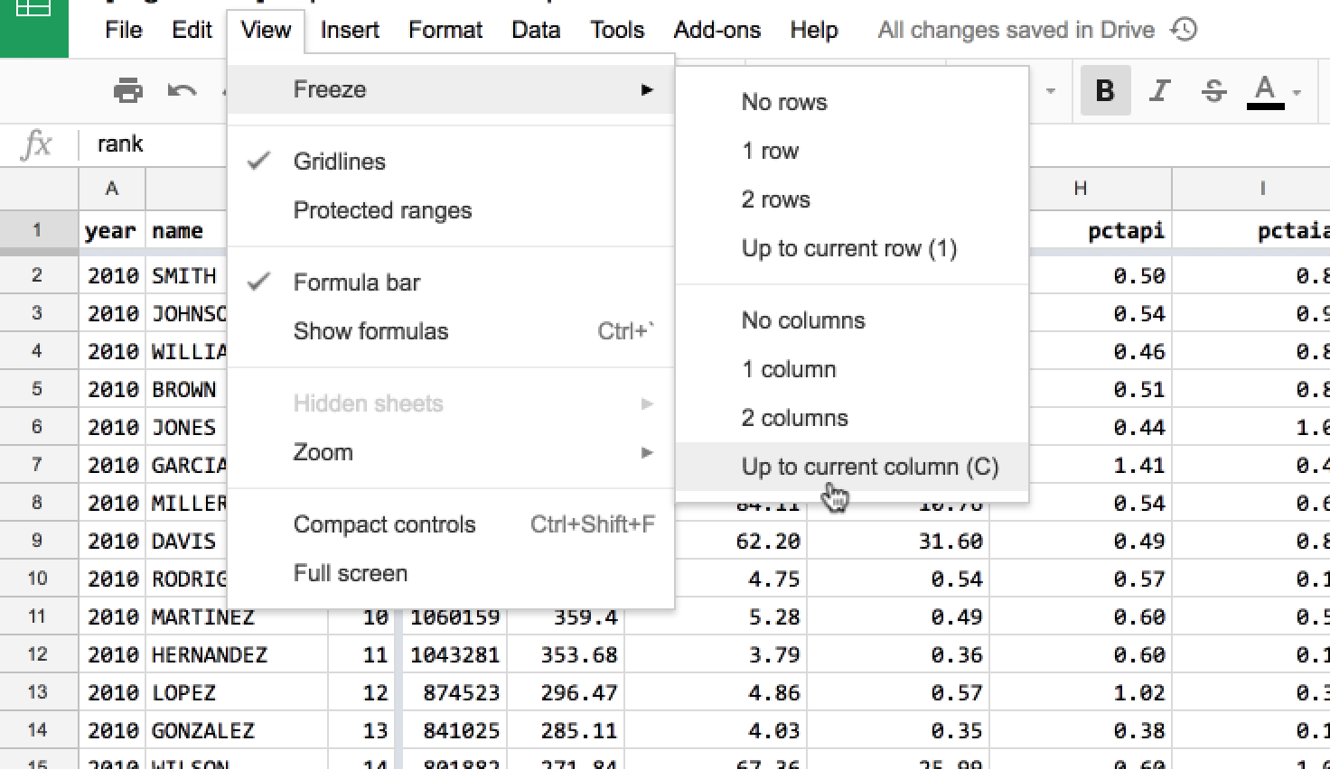
To freeze one, two, or more columns, go to the menu, View > Freeze:
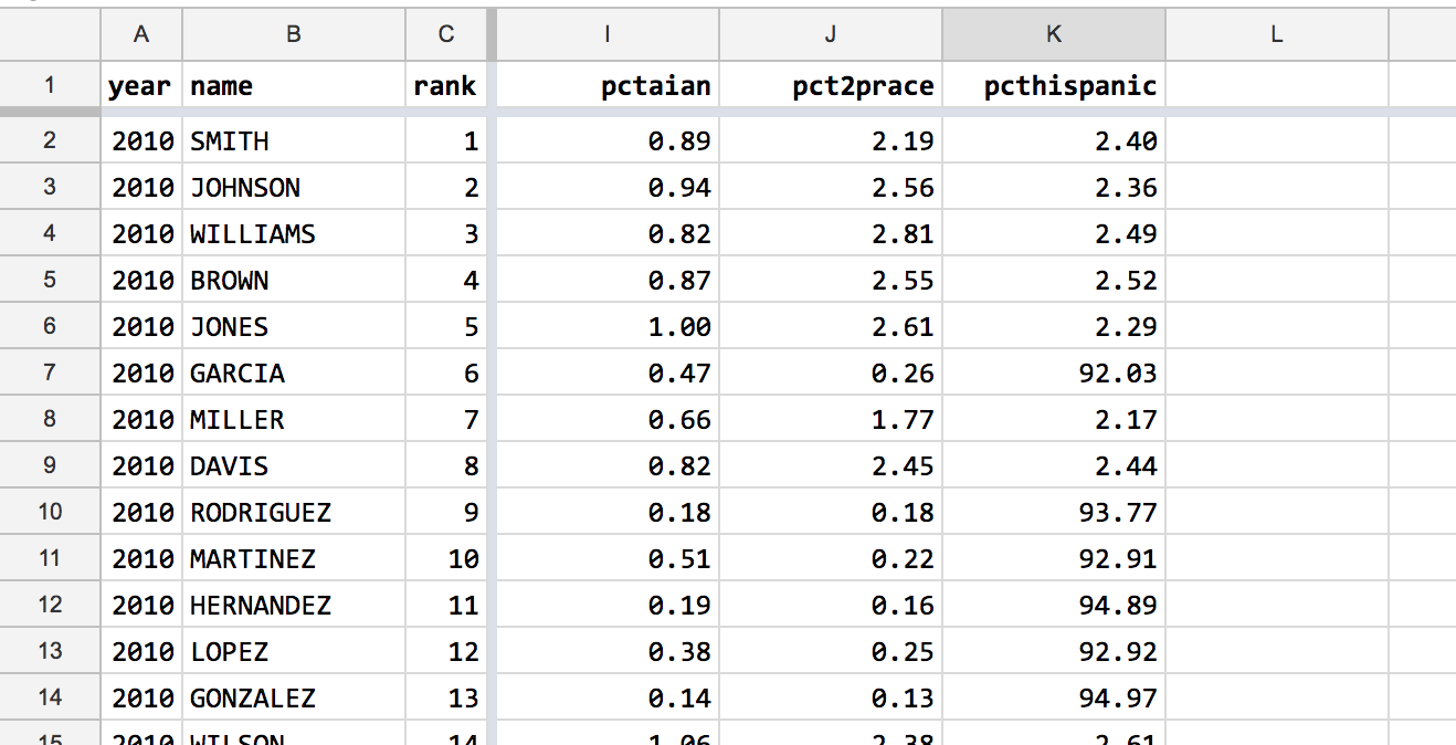
The result:
Data re-arrangement
The following steps don’t alter the actual data values or content, but do change the structure of the spreadsheet. For the most part, the steps are reversible.
Sort percentage columns by size of racial/ethnic group in America
The Census data has 6 percentage-value columns for displaying the ethnic/racial demographic of each name. Currently, this is the order of the columns, from left to right:
- pctwhite
- pctblack
- pctapi (Asian Pacific Islander/Native Hawaiian)
- pctaian (American Indian and Alaska Native Alone)
- pct2prace (Two more races)
- pcthispanic (Hispanic or Latino origin)
(All of the columns, except pcthispanic, refer to Non-Hispanic members)
Hispanic/Latino isn’t considered a racial group, which is probably why the data column is grouped together like the others.
More about how the Census counts race and ethnicity and Hispanic origin:
- https://www.census.gov/topics/population/race/about.html
- https://www.census.gov/topics/population/hispanic-origin.html
That said, these percentage columns all add up to 100% – i.e. the people counted in pcthispanic aren’t being double-counted. You can verify this by creating a new column with this formula that adds up the six percentage columns:
=F2 + G2 + H2 +I2 + J2 + K2
When browsing the data for each name, my eyes naturally turn to the pctwhite column to see if it’s a “mostly white” or “mostly non-white” name. In the latter situation, when a surname isn’t held by a majority white American demographic, it’s often a majority Hispanic-American name, given the relative population of the Hispanic community compared to other groups. But to see that when looking at the data, I have to scroll the spreadsheet to the far-right, as pcthispanic is the furthest-right column.
It’d be more logical to arrange the columns by the relative size of the racial/ethnic groups in this dataset. If few American surnames are held by significant number of Asians, it doesn’t make sense to have the pctapi column be before pcthispanic, for example.
Using pivot tables to estimate racial/ethnic representation
Rather than guessing, let’s go straight to the data.
First, let’s see what the maximum pct value each group has in this dataset.
Create a new Pivot Table.
In the Rows section, add the year column. Not that it’s particularly relevant, but I don’t think we can aggregate without a row field.
In the Values section, add each of the 6 percentage columns, and summarize them with the MAX function:
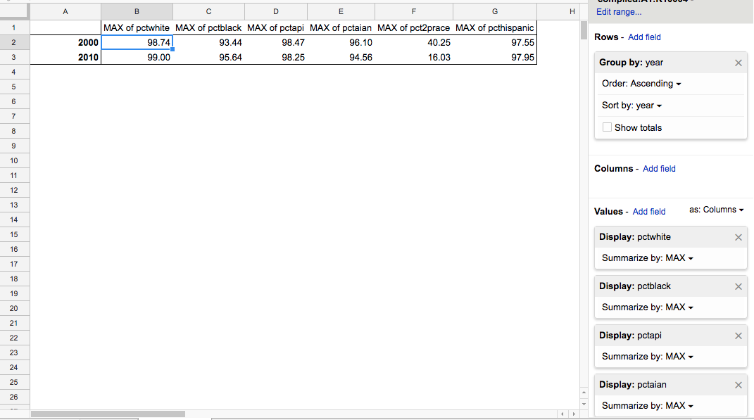
Looks like 5 of the 6 groups have a MAX value of greater than 90 percent. With the exeption of the groups, with the exception of pct2prace, which strangely dropped from 40% to 16% from 2000 to 2010.
That doesn’t mean that Asians or Native Americans are as large, numerically, as Hispanics and Whites. 90% of a top 100 most common surname is a lot different than 90% of the 4000th most common surname, by an order of magnitude.
It’s possible to calculate numbers of people per group, but let’s save that for another exercise.
Ranking groups by average representation
Again, relying on percentages provides a limited picture of how numerous a racial/ethnic group is. On the other hand, using MAX(pct) as a metric seems off, as it makes it seem that all groups have a high representation.
Duplicate the pivot table used to calculate the MAX function, and change each of the value fields to calculate the AVERAGE. The resulting table shows a greater disparity between the groups:
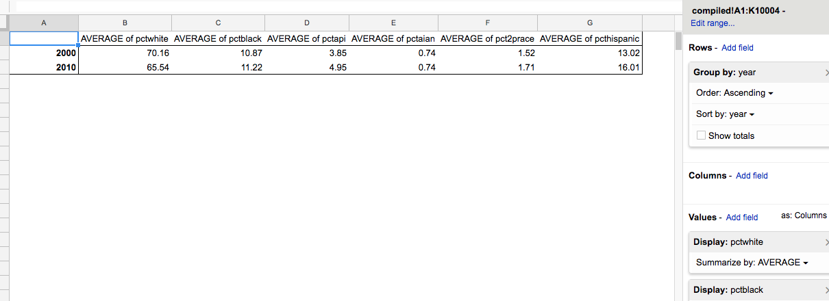
Faceting the data by year seems to align with the belief that America is becoming more ethnically diverse. Not that we’d have to look at last names to do that calculation – the Census already collects and publishes this data. Is it interesting that demographics of surnames are seeing change? And how does this change reflect or compare to the change in the more general demographic statistics?
(If you’re interested in Census data, check out CensusReporter. It’s one of the best sites when it comes to organizing and making sense of Census data)
In any case, I think we can be justified in rearranging the columns in order of their average percentage representation in the dataset:
- pctwhite
- pcthispanic (Hispanic or Latino origin)
- pctblack
- pctapi (Asian Pacific Islander/Native Hawaiian)
- pct2prace (Two more races)
- pctaian (American Indian and Alaska Native Alone)
Again, this type of change can be rearranged and reversed as needed. It’s just dragging columns around:
Sorting data by name and year
Currently, the compiled surname data is sorted by:
year- all 2010 entries come before the first 2000 entrycount- in descending order, biggest number on topname- a few of the names have the same exact count. These names are ordered in alphabetical order.
I don’t think I need to change it. But there are other ways to sort the data that might be appealing depending on what you’re interested in.
For example, I think we can assume many people in the 2000 dataset are also in the 2010 dataset. If we sort the data using these columns:
name- alphabetical orderyear- chronological order – a person’s 2000 entry will be before their 2010 one
Since all names are unique in a given year, there’s no need for another column to sort in a tie-break.
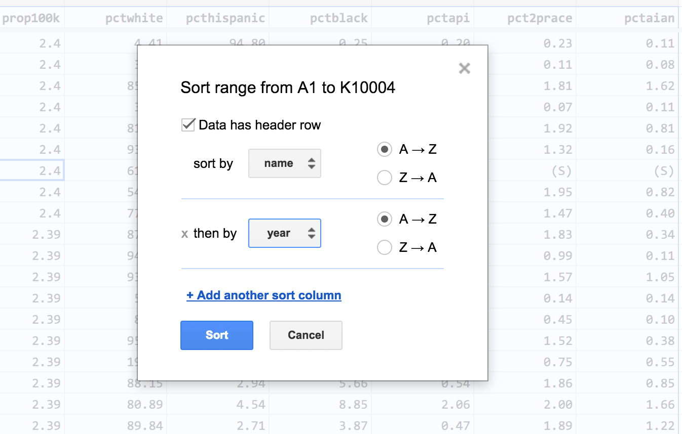
In Google Sheets, we can sort by multiple columns using the Data > Sort range… action. First, we have to select all of the spreadsheet (Command/Ctrl+A).
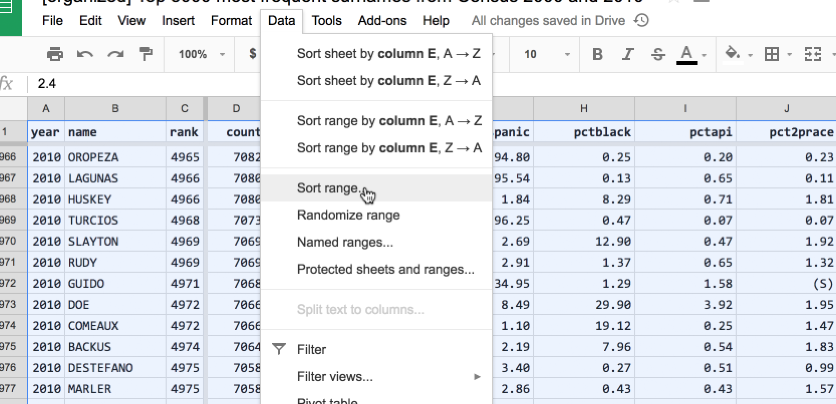
In the dialog box, check the Data has header row option. Then specify two column sorts:
- sort by name, A -> Z
- sort by year, A -> Z
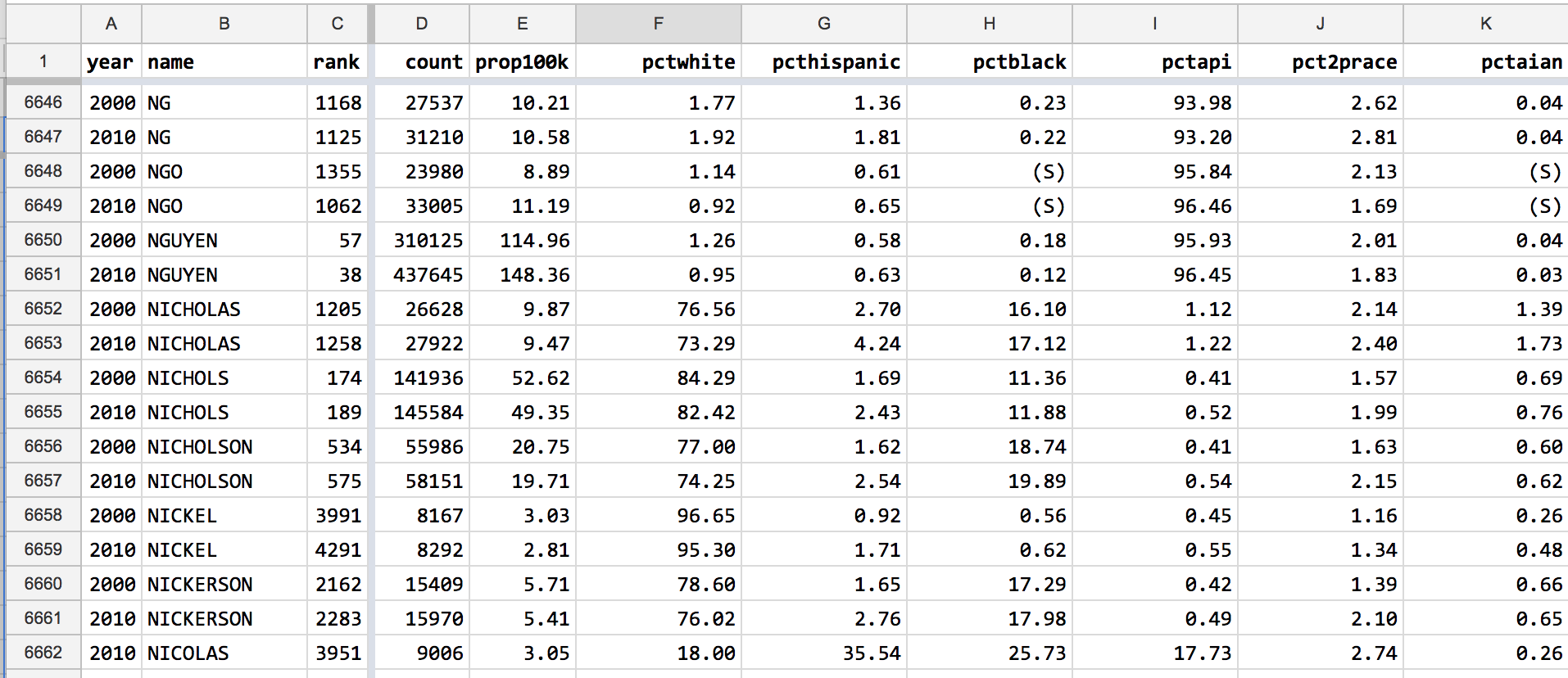
For any surname that appeared in both Census datasets, it is very easy to casually compare the difference:
Because I don’t think being able to compare individual names is very interesting or productive, I don’t think this sort is needed. On the other hand, the sorting order doesn’t really matter when we use Pivot Tables to process and summarize the data.
Destroying and altering data
In general, you should never, ever delete data rows or columns. Because it becomes near-impossible to not just reverse the action, but to even keep track of it. It is always, always better to add a column and hide an annoying column.
In the case of rows that represent useless data, create a column titled is_junk. For junk data rows, set that column value to TRUE. Anytime you need to ignore those junk data rows, you filter by the column. If it turns out you need the data, you never lost track of it in the first place.
Always better to flag and hide than to delete or permanently alter.
That said, I’m interested in doing a couple of permanent deletion operations on the compiled Census data.
Deleting the cum_prop100k column
If you are using my versions of the Census surname data, you never saw this column. The Census data barely fit into Google Sheets’s 2 million cell limit. And while the cum_prop100k column provided a convenience – for any given rank, you could see what percentage of Americans had a surname of equal or more frequency – a cumulative calculation is not useful for most analysis.
In any case, the calculation could easily be re-done, as it is completely derived from the rank and prop100k columns and contained no unique data.
Re-creating this column was covered in the lesson, How to Excerpt the Census Surname data.
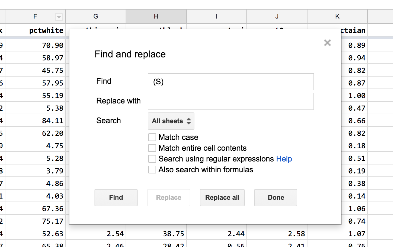
Replace the (S) values with blanks
For names with relatively low frequency, and relatively low adoption in the various ethnic groups, the Census has chosen to omit the actual percentage of an ethnic/racial group that has the surname for confidentiality reasons. That seems like a sensible practice, but those non-number values in my numerical columns bother me.
The Find text function in Google Sheets (Ctrl/Command+F) says that the (S) text string appears 304 times. Sorting from small-to-big in the various pct columns brings these (S) values in droves:
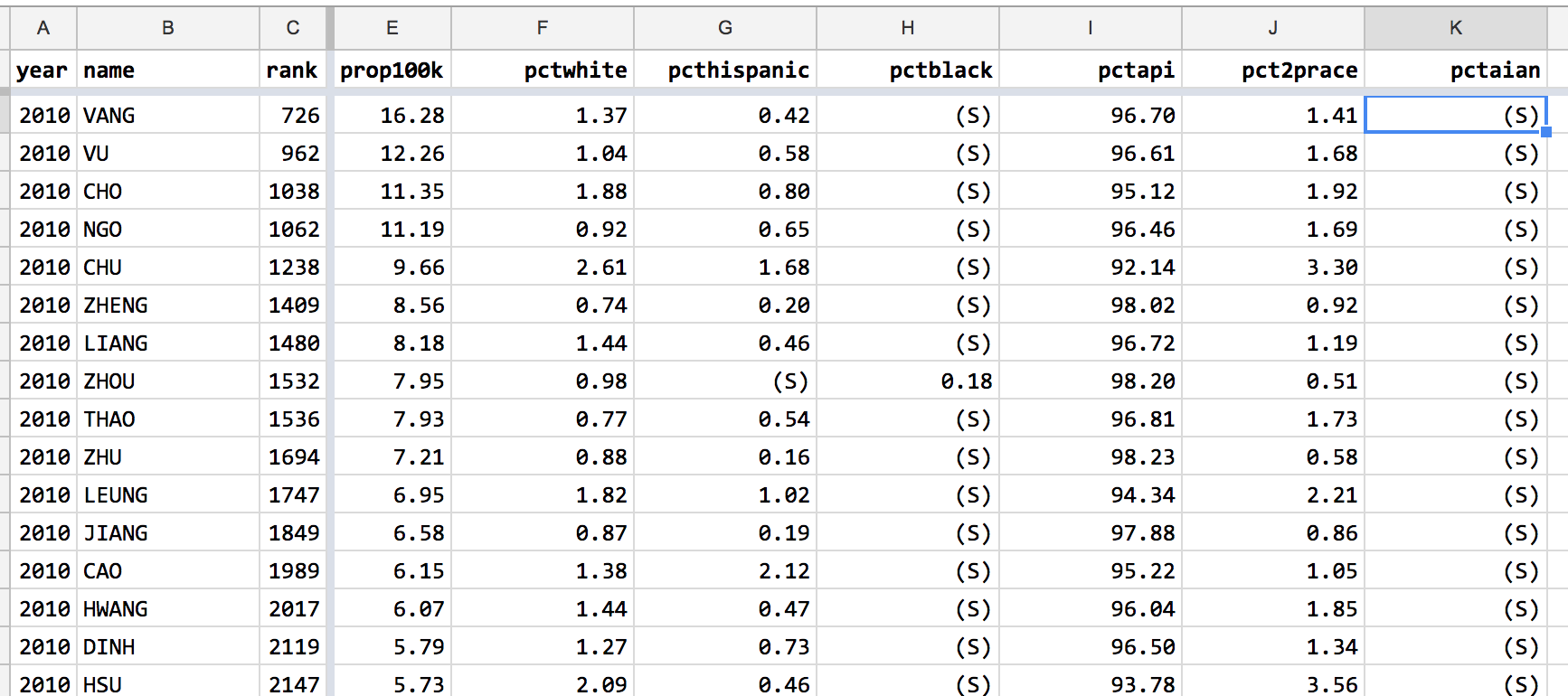
I’m not sure how those non-numerical values affect aggregate calculations, such as averages. I assume the effect is pretty minor. But I don’t like the visual distraction. Furthermore, it seems like those values can be represented with blanks values, which are different than the value of 0.
Those text values can be quickly replaced with blanks using with Google Sheets’ Find-and-Replace:
Note: I still strongly discourage you from ever altering original data values in any dataset. Even this situation was a bit of an edge case. Theoretically, I could replace all blank cells with (S), but I never checked to see if there were any existing blank cells in the original data.
The bigger problem is a documentary one. Anyone else who uses this dataset won’t know what those blanks mean. As inconvenient as the (S) values are, at least they were annoying and confusing enough that you’d be forced to look up their significance. A blank value could mean any number of things.
Since the (S) value doesn’t seem to be breaking anything, I’ll leave it in. It will cause problems if this data is ever imported into a database that has strict rules about uniformity of data in each column…
Conclusion
This tutorial doesn’t make any major changes to the data or how we use it. Feel free to ignore the steps, or use the data from my spreadsheet going forward. The organized tab contains the tidied-up version described in this lesson:
[organized] Top 5000 most frequent surnames from Census 2000 and 2010
But remember that organizing data is your own job. The provider/maintainer of data didn’t design it for you. The more confident you are with how to modify and wrangle data, the more confident you’ll be in exploring it for insights.