CanViz: Stanford’s Historical Tuition Rates [2017-09-27]
Attention
- Slugline
- padjo-2017 can-viz stanford-tuition-history your_sunet_id
Turn-in instructions
Send an email to dun@stanford.edu
Subject line should be almost exactly like the following (spacing, case, etc.) except for your Sunet ID:
padjo-2017 can-viz stanford-tuition-history lelandjrTake a photo or scan of your creation and attach it to the email
- Due
- 2017-09-27 23:59
- Description
- Before we get into learning visualization tools and struggling with the inherent complexity of data, let’s warm up with a hand-drawn chart of simplified tuition rates.
Background
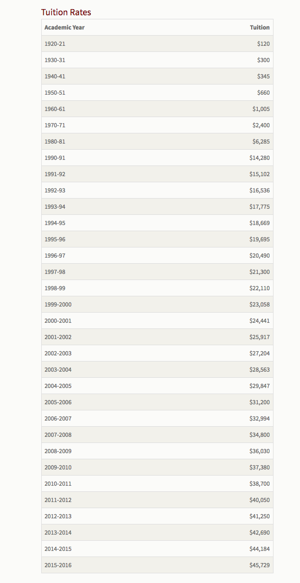
If you are reading this homework assignment, you are probably aware of, if not acutely aware of Stanford’s tuition schedule. But even as tuition rates are set and quantified – $16,329 per quarter for undergraduates, as of 2017-2018 – you also know that it doesn’t tell the whole story of cost and benefit. Financial aid packages, scholarships, and additional fees are all significant enough to make the tuition rate nearly incidental to the total cost.
That said, the tuition rate is something that we can measure every year. While the tuition rate for the current year may not be interesting by itself, what does it look like in comparison to the rates of past years and even decades?
Stanford’s Administration/Finances website has published a table of historical rates dating all the way back to 1920, when Stanford first began charging for $40 per quarter.
Here is a screenshot of that table:
Directions
Using the numbers from the screenshot of the tuition table draw – i.e. with pen/pencil and paper – a chart representing that data.
That’s it. No other requirements, including what type of chart (e.g. bar, line, pie) or what best practices to be mindful of. Or, most importantly, how to deal with the incomplete and complicated nature of the data (see the Caveats section below).
So give it your best try but not much more than 15 minutes. Use a ruler or grid-paper if you want, but it doesn’t have to be razor precise (that’s what computers are for).
However, please don’t make something as abstract/inaccurate as this:
Don’t worry about all the other factors that you believe to be relevant in analyzing historical tuition rates. For this challenge, you can focus just on the simple numbers.
Note: There’s a reason I’ve provided only a screenshot of the data, as opposed to a webpage or a table. You’re supposed to do this by hand. Entering the data into a spreadsheet to make a chart is definitely the right idea in practice. Just not for this introductory challenge.
Hints and Caveats
- If you’ve taken an economics course, you may know the concept of “inflation”. That is definitely a real factor but don’t worry about it for this exercise.
- Before the most recent decades, Stanford did not raise tuition every year. However, the provided tuition chart does not show all of the incremental increases. For example, it only has the tuition for 1950-51 and 1960-61 – $660 and $1005, respectively. It does not include the 1954-55 tuition hike to $750.
I leave it to you to figure out how to deal with that gap (don’t spend your time searching the Daily Archives, unless you have time to waste).
Purpose
This is the only CanViz challenge that will be hand-drawn, so the priority here isn’t to make something beautiful or even particularly insightful. In fact, as this is the first CanViz challenge, I don’t expect you to know anything about making data visualizations, so there’s not many requirements here except…try your best.
Even if you have made data charts before, maybe you’ve taken for granted the fundamental math that dictates the relationship between data and its physical representation. An ongoing theme of this course will be that computers are fundamentally dumber than you. Whatever bespoke process you use to convert the tuition rates to a semi-accurate and useful chart will be far more sophisticated (though necessarily better) than any visualization program.